





In Qatar, a brand has to work in two languages and two scripts. It appears on shopfronts, vehicles, uniforms, social media, websites and government documents. A logo that looks great in English can feel unbalanced next to its Arabic version if the two were not designed together.
This guide covers the parts of a brand identity that matter most and how to make them work in both languages.
- Design the Arabic and English logos together, with equal weight.
- Pair fonts with similar character and test them with real content.
- Check colours on screens, in print and in sunlight.
- Simple guidelines and templates keep the brand consistent.
Design the Arabic and English logos together
The strongest bilingual logos are designed as a pair from the start. The Arabic and English names should have similar visual weight, height and spacing, so neither looks like an afterthought. Prepare horizontal and stacked versions, and check how the logo reads at small sizes, such as a social media profile picture or a favicon.
Choose fonts that pair well
- Pick an Arabic and a Latin font with a similar character, for example both geometric or both humanist.
- Test real content in both scripts, including headings, body text, numbers and buttons.
- Allow more line height for Arabic, which usually needs extra space to stay comfortable to read.
- Check licences so you can use the fonts on your website, print and apps.
Build a colour palette with purpose
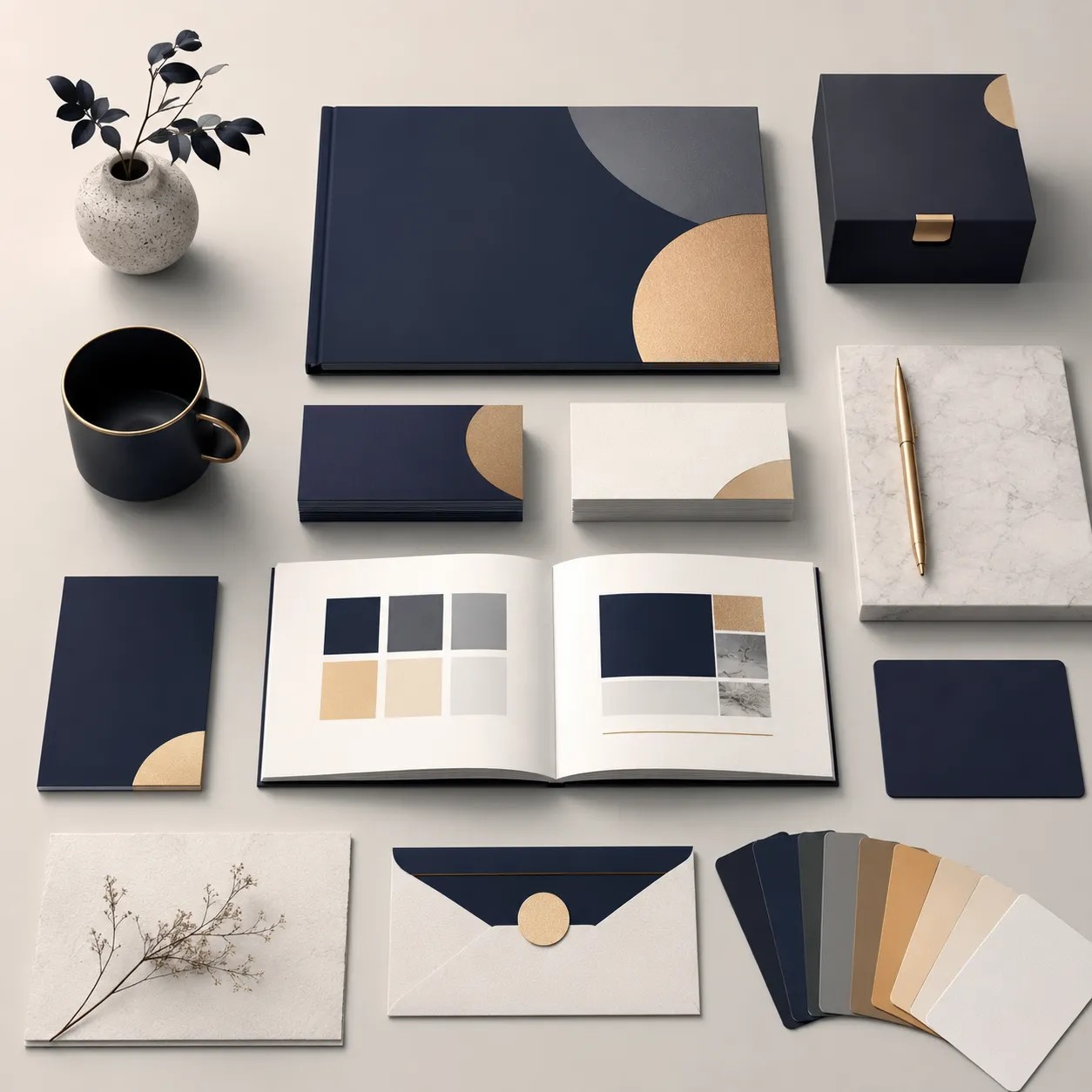
Choose one or two main brand colours, a few supporting colours and clear neutrals. Check contrast so text stays readable on screens and in sunlight, and test how the colours print on signage, vehicles and uniforms. Consider how your colours sit next to competitors in your sector so you stand out.
Write simple brand guidelines
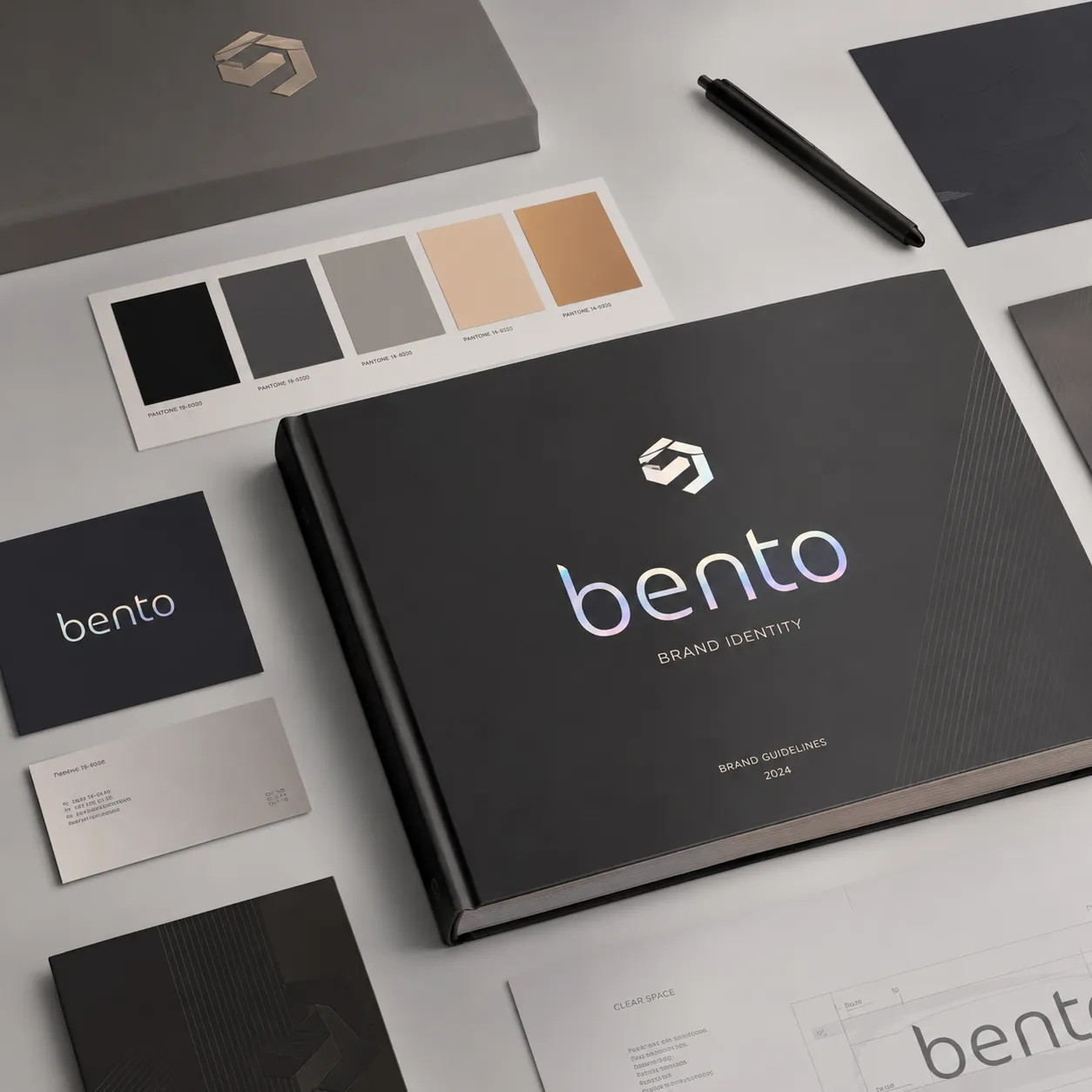
- Logo rules: versions, minimum sizes, clear space and examples of what not to do.
- Colour and typography: exact colour codes for screen and print, plus font sizes for headings and body text in both languages.
- Imagery and icons: the style of photos, illustrations and icons that fit the brand.
- Tone of voice: how the brand speaks in Arabic and English, with example phrases.
- Templates: social posts, presentations, letterheads and email signatures so the team stays consistent.
Roll it out everywhere at once
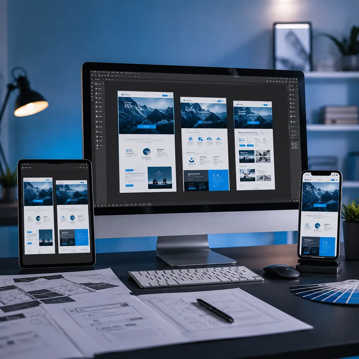
Update your website, social profiles, Google Business Profile, signage and documents together. A consistent brand across every touchpoint builds recognition faster and makes your business look established.

A bilingual digital marketing and web development agency in Doha, helping businesses across Qatar grow through search, social media, websites and branding. About our team